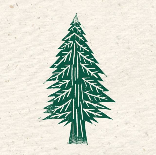
We have created illustrations that we use on our packaging and social media. They can also be used to liven up presentations, leaflets or other documents. We always make sure that our illustrations are instantly recognisable as Whole Earth. So, if you don’t include the illustration of the jar, ensure that you do include the illustration of the trees. Our illustrations look their best when in their original colour and on textured paper. However, they can be adapted to fit various situations.
Useful Tips
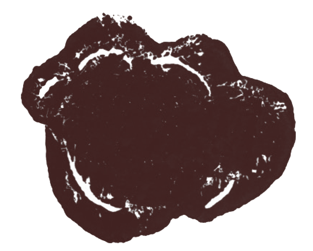
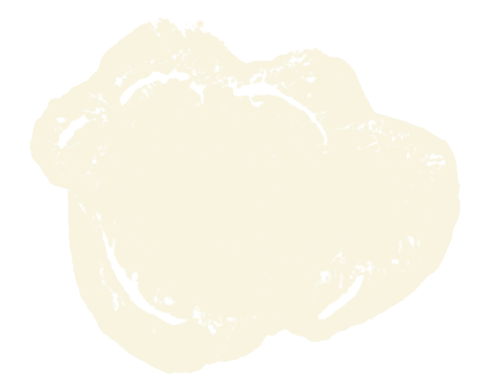
As well as their original colour, the illustrations can appear in the Whole Earth brown or light cream.
PANTONE 4975C
PANTONE 7499C 30%
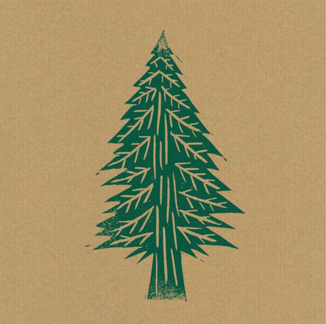
They look their best on a textured/craft paper background, however they can also be used on white or other colours, as long as these are not too bright or artificial.
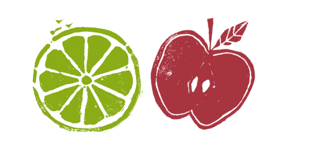
We like the look of these
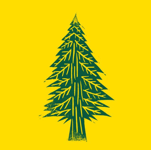
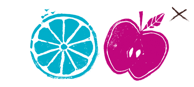
…but not the look of this
When changing the colours of the trees, keep them as one tone, rather than mixing it up with multiple colours. And stick with natural colours, rather than bright acidic colours.


This rule applies when adding it to our other illustrations – a lime should never be blue, and an apple should never be bright pink.
Bullet points
This can be used in the original illustration colours, Whole Earth brown or cream or in any of the greens from the Whole Earth logo. Please don’t use any larger than 4mm wide.

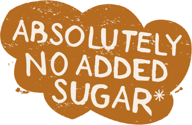
The clouds and the sun can be used as graphic devices to hold various messages:
Please make sure you leave enough room between the type and the edges of the shapes.

And finally
We welcome anyone to commission bespoke illustrations if they lend themselves towards a specific brief. If you’d like to try this then you can get in touch with your Whole Earth contact.